
How to Convert Dental Website Visitors Into Patients
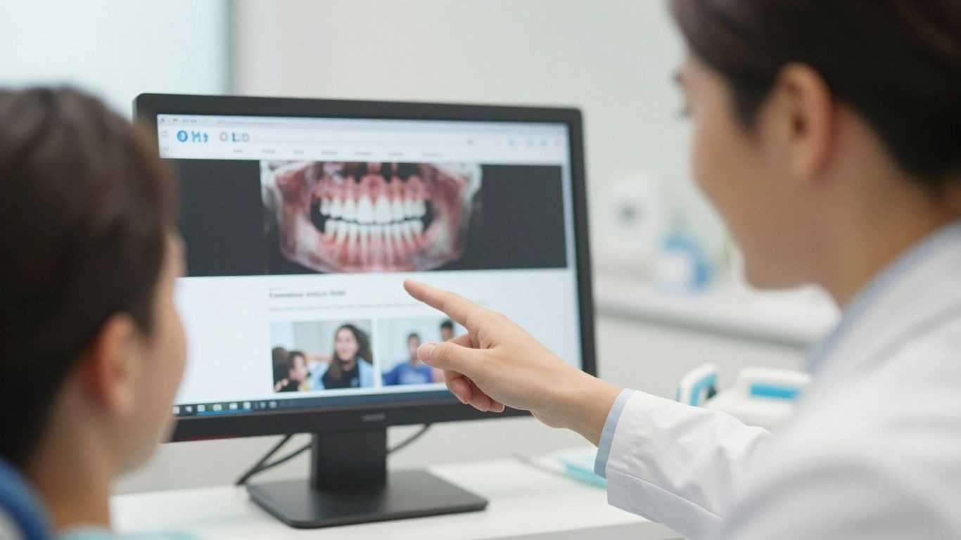
Getting people to your dental website is one thing, but getting them to actually book an appointment? That's the real challenge. Many dental sites look nice but don't do much else. They're like fancy brochures that don't convince anyone to visit. We'll get into how to fix that, turning those clicks into actual patients for your practice. It’s about making your website work for you, 24/7.
Key Takeaways
- Most dental websites don't convert visitors into patients because they look generic and don't showcase what makes the practice unique.
- A good dental website needs to be more than just pretty; it should be a tool that actively brings in new patients by making it easy to connect and understand the practice's value.
- Clear calls to action on every page are vital for directing visitors toward booking an appointment.
- Using real photos and videos of your team and patients builds trust and connection, which stock images can't do.
- Website speed, mobile-friendliness, and easy navigation are crucial for keeping visitors engaged and preventing them from leaving.
How to Convert Dental Website Visitors Into Patients?
So, you've got people landing on your dental website. That's step one, right? But are they actually doing anything once they're there? Most dental websites are basically digital tumbleweeds – lots of visitors, but very few actual bookings. It's like having a fancy storefront with the door locked. We need to get those visitors to walk in and book an appointment. That's the whole point of having a website for your practice, after all.
Why do most dental websites fail to turn visitors into bookings?
Honestly, a lot of dental websites just aren't built to convert. They look okay, maybe even pretty, but they don't really do anything. Think about it: they often use generic stock photos, talk about the same old services in the same old way, and don't give visitors a clear reason to pick this practice over another. People are looking for solutions to their problems, not just a list of procedures. If your site isn't making it super easy and obvious for them to take the next step, they'll just click away. It's a missed opportunity, plain and simple. Your website should be working harder than your front desk, available 24/7 to welcome and guide potential patients.
Here's a quick look at why many sites fall flat:
- Lack of Clear Value Proposition: Visitors don't immediately understand what makes your practice special or why they should choose you.
- Poor User Experience: Clunky navigation, slow loading times, or a confusing layout can drive people away before they even find what they're looking for.
- Missing or Weak Calls to Action: If you don't tell people exactly what you want them to do next (like 'Book Now' or 'Call Us'), they won't know.
- Ignoring Patient Needs: Websites often focus on what the practice does rather than how it helps the patient solve their pain points or achieve their goals.
The digital world moves fast, and people have short attention spans. If your website doesn't grab them and guide them quickly, they're gone. It's not about having the most features; it's about making the path to becoming a patient as smooth as possible.
Ultimately, the goal is to turn that website visit into a real patient inquiry. If your site is only getting a small percentage of visitors to take that next step, you're leaving money on the table. We need to fix that.
Dental Website Conversion Tips to Boost Patient Inquiries
So, your dental website is up and running, but it's not exactly bringing in a flood of new patients, huh? That's a bummer. A lot of dental sites look pretty, but they don't actually do much. They're like a fancy brochure that doesn't tell you how to buy anything. We need your website to work harder for you, acting like a 24/7 receptionist that can book appointments. Let's talk about some simple dental website conversion tips that can make a real difference.
What design and content changes make the biggest difference?
First off, is your website easy to use? Seriously, if people can't figure out where to go or what to click, they're just going to leave. Think about it: if you visit a site and it's confusing or looks like it's from the early 2000s, you probably won't stick around, right? That's a huge reason why potential patients get lost – about half of them, actually. And if their first visit is a bad experience, forget about them coming back.
Here are a few things to check:
- Clear Navigation: Make it super simple for visitors to find what they need. No one wants to hunt for your phone number or services.
- Mobile-Friendly Design: Most people browse on their phones these days. If your site looks wonky or is hard to use on a small screen, you're losing patients. Make sure buttons are easy to tap and text is readable.
- Fast Loading Speed: If your pages take too long to load, people will click away. Test your site's speed and see where you can trim the fat.
- High-Quality Images: Use clear, professional photos of your practice and staff. Avoid cheesy stock photos if you can.
- Patient Testimonials: Real stories from happy patients build trust. Make them easy to find and read.
Your website should be a tool that actively brings in new patients, not just a digital business card. If it's not working for you, it's time for a tune-up.
Remember, a good conversion rate means you're turning more visitors into actual appointments. For top sites, this can be around 10%, but the average is more like 3-5%. If you're below 3%, it's definitely time to make some changes. We want your website to be a patient-booking machine, not just a place to look pretty.
Dental Website Call to Action Best Practices
So, you've got people clicking over to your dental website. Awesome! But are they actually doing anything once they get there? That's where your call to action (CTA) comes in. Think of it as the friendly nudge that says, "Hey, we're here, and we can help!" Getting these right is a big deal for turning website browsers into actual patients.
Where should you place call to action buttons for maximum clicks?
This is where a lot of dental websites miss the mark. You can't just stick a "Book Now" button in a random corner and expect magic. People are busy, and they need clear directions. The best CTAs are visible and placed where someone is likely to be thinking about their next step.
Here’s a breakdown of smart places to put those all-important buttons:
- Above the Fold on Your Homepage: Right when someone lands on your site, they should see a clear option to take action. This could be "Schedule a Consultation" or "Find Your New Smile." Make it obvious.
- Within Service Pages: If someone is reading about, say, teeth whitening, a CTA like "Get a Quote for Whitening" or "See Whitening Before & Afters" makes perfect sense right there.
- At the End of Blog Posts: After you've shared some helpful info, guide them to the next step. A CTA like "Ready to Discuss Your Dental Health?" or "Book Your Check-up Today" works well.
- On Your Contact Page: This one's a no-brainer, but make sure it's prominent. "Send Us a Message" or "Call Us to Schedule" should be front and center.
- In the Website Header and Footer: Having a consistent CTA in these areas means it's always accessible, no matter where a visitor is on your site.
Don't make potential patients hunt for how to contact you or book an appointment. If it's hard to find, they'll likely just leave and find a dentist who makes it easy. Think about what someone in pain or someone excited about a new smile needs right now and put the CTA there.
It's also worth noting that mobile design is super important here. If your CTA buttons are tiny and hard to tap on a phone, you're losing a huge chunk of potential patients. Make sure they're big enough and easy to click, even on a small screen. Remember, a good CTA isn't just about the words; it's about making it super simple for someone to take that next step with your practice.
How to Get More Patients From Your Dental Website
So, you've got a dental website up and running. That's great! But are you actually seeing new patients walk through the door because of it? If not, it's time to figure out how to turn those clicks into appointments. It's not just about looking good online; it's about making your website work for you. Let's talk about how to get more patients from your dental website.
What Pages on Your Website Drive the Most Patient Conversions?
Not all pages on your website are created equal when it comes to bringing in new patients. Some pages are just there to provide information, while others are designed to make someone pick up the phone or click that "Book Now" button. You need to know which ones are doing the heavy lifting and which ones need a serious makeover.
- Homepage: This is often the first impression. It needs to be clear, welcoming, and immediately tell visitors what you do and why they should choose you. Think about having a clear call to action right at the top.
- Services Pages: People usually land on your site looking for a specific treatment, like "teeth whitening" or "dental implants." These pages need to be detailed, answer common questions about the procedure, and make it easy to book a consultation for that service.
- About Us/Meet the Doctor Page: Patients want to know who they're trusting with their health. Showcasing your team's personality, qualifications, and your practice's philosophy builds trust. This page can be surprisingly effective at converting hesitant visitors.
- Testimonials/Reviews Page: Social proof is huge. Seeing positive experiences from other patients can be the deciding factor for someone on the fence. Video testimonials are especially powerful here.
- Contact Us Page: Make it super simple for people to get in touch. Include your phone number, address, a map, and a contact form. If you offer online booking, make that link prominent too.
Understanding which pages are performing best requires looking at your website analytics. Tools like Google Analytics can show you which pages visitors spend the most time on, where they come from, and if they complete a desired action, like filling out a form or calling your office. Focus your efforts on optimizing these high-performing pages even further.
It's all about guiding visitors smoothly from learning about you to becoming a patient. If a page isn't helping with that journey, it might be time to rethink its purpose or content.
How to Increase Dental Patient Bookings From Your Website
So, you've got people clicking over to your dental website. Awesome! But are they actually booking appointments, or just browsing? If it's the latter, we need to talk about how to turn those clicks into actual patients. It’s not just about looking pretty online; it’s about making your website work for you, 24/7.
Think of your website as your virtual front desk. It needs to be welcoming, informative, and make it super easy for folks to take the next step. Most dental sites are kinda… meh. They look the same, use generic photos, and don't really answer the questions people have. That's a missed opportunity.
Here’s the deal: people are looking for answers. They want to know if you take their insurance, how much things cost, what your hours are, and if you're the right fit for their dental needs. If your site doesn't provide that info clearly and quickly, they'll bounce. Making your website a go-to resource for patient questions is key to getting more bookings.
What really gets people to pick up the phone or click that 'book now' button?
- Clear Contact Info & Hours: Don't make people hunt for your phone number or address. Put it front and center.
- Online Booking: Seriously, this is a game-changer. Many people prefer booking online over calling. If you don't have it, you're probably losing patients.
- Patient Testimonials & Before/Afters: Showcasing happy patients and real results builds trust like nothing else.
- Answering Common Questions: Have a FAQ section that tackles insurance, costs, new patient specials, and what to expect.
- Meet the Team: Introduce your dentists and staff. People want to know who they'll be seeing.
A website that's easy to use, especially on a phone, and answers all the burning questions upfront is way more likely to get someone to book an appointment. It's about making the process smooth and reassuring.
If your website is slow to load, cluttered, or hard to navigate on a mobile device, you're already losing people. Aim for a clean, modern design that loads fast. Remember, a visitor who converts is worth way more than a hundred who just look around. Let's get those bookings rolling in!
So, what's the takeaway?
Alright, so we've gone over a bunch of stuff about making your dental website actually work for you. It's not just about having a pretty online face; it's about making it easy for people to find you, understand what you do, and then, you know, actually book an appointment. Think of your website as your best employee – always on, always ready to help. By focusing on making it user-friendly, clear, and trustworthy, you're basically setting yourself up for more patients walking through the door. It takes a bit of effort, sure, but turning those clicks into appointments? Totally worth it.
Frequently Asked Questions
Why isn't my dental website getting enough appointments?
Many dental websites don't get enough appointments because they look boring, say the same things as other sites, and don't really show what makes the practice special. If a website is hard to use, slow to load, or doesn't make it easy to book an appointment, visitors might leave and go somewhere else. It's like having a shop with a locked door – people can see it, but they can't get in.
What's the most important thing for a dental website?
The most important thing is making it super easy for people to book an appointment. This means having clear buttons that say 'Book Now' or 'Schedule Appointment' on almost every page. Also, your website should work perfectly on phones, load quickly, and have real pictures of your team and happy patients. It needs to feel trustworthy and helpful.
How can I make people want to book an appointment on my website?
To get more people to book, make sure your website clearly shows why your practice is the best choice. Use real patient stories and before-and-after pictures to prove it. Make it simple to find your phone number and contact info. Offer different ways to get in touch, like a contact form or even a chat option. Also, make sure your website explains treatments in a way that's easy to understand and less scary.
Where should I put 'Book Now' buttons on my website?
Put 'Book Now' buttons everywhere a visitor might think about making an appointment! This includes the top of every page, near your phone number, on service pages, and at the end of patient testimonials. Make them stand out with a bright color so they're impossible to miss. The easier it is to find, the more likely someone is to click it.
What kind of content works best for getting new patients?
Content that shows real people and real results works best. This means having videos of happy patients sharing their experiences, photos of your friendly dental team, and before-and-after pictures of treatments. Writing in a friendly, conversational tone also helps. People want to connect with real humans, not just read boring descriptions of services.
How fast should my dental website load?
Your website needs to load super fast, especially on phones! Most people expect a page to load in 2 seconds or less. If it takes longer than 3 seconds, almost half of the visitors will leave. Slow loading times can be caused by big images or old website code, so it's important to fix these issues to keep visitors from going to a competitor's site.
Blog Post Author


Please login to publish a comment.
Comments (0)